Builder Residential House Plans Under 200m2 for NSW & QLD

Smaller homes are not the budget compromise they used to be. In the right hands, builder house plans under 200m2 Gold Coast Sunshine Coast Sydney Armidale Grafton Coffs Harbour can outsell bigger, clumsier homes because buyers are chasing smarter space, stronger street appeal and layouts that do not feel like recycled brochure stock. That is exactly where sharp builders and switched-on home buyers can gain ground – with homes that feel original, commercially sensible and easy to adapt for local demand.

This is not about squeezing rooms into a box. It is about getting the plan right from the start so the home reads well on paper, builds efficiently and still has the punch to stand apart in a crowded market. Under 200m2 can be a serious sweet spot for project builders, boutique builders and owner-builders alike, especially when land prices are doing the heavy lifting in coastal and regional markets.

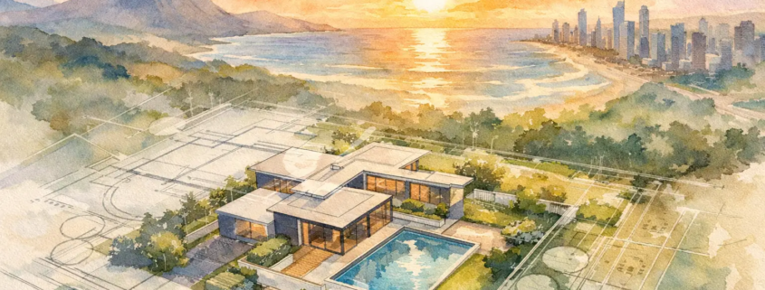
Why builder house plans under 200m2 work in Gold Coast, Sunshine Coast, Sydney, Armidale, Grafton and Coffs Harbour

These markets are not identical, and that matters. Gold Coast and Sunshine Coast buyers often want relaxed open-plan living, strong indoor-outdoor flow and facades that feel fresh rather than fussy. In Sydney, tighter lots and sharper construction costs put more pressure on every square metre. Armidale, Grafton and Coffs Harbour can lean more practical, but practical does not mean plain. It means the plan has to earn its keep.

That is where under 200m2 plans become commercially attractive. They can lower build costs, help maintain margin and suit a wider buyer pool, but only if the layout avoids the usual traps – long dark corridors, oversized circulation zones, awkward bedroom placement and living areas that look generous in a brochure yet feel cramped once furnished.

This is clearly evident in the design from the Homestarter range being the Campaign 182, ask yourself what kind of design a builder would create with five living rooms in a modest, compact 182m² footprint. It all comes down to the details—how the layout flows, where and how walls are placed to achieve style, and how to minimize wasted space like hallways, putting more of the area back into habitable spaces where it truly makes a difference.

The better approach is to make the footprint feel bigger than the number suggests. That comes from alignment, sightlines, natural light and roof-driven form, not from adding bulk for the sake of it. Cookie-cutter plans miss this. Smart builders do not.

The real difference is not size – it is layout intelligence

A 185m² home with a smart, open layout can feel more upscale than a 215m² home that squanders space. Buyers pick up on it instantly, even if they can’t say exactly why. The kitchen functions beautifully, placed as the true heart of the home rather than an afterthought. The living rooms enjoy light, and the smaller bedrooms are tucked away for added privacy. The entire space feels more thoughtfully designed.

For builders, that is where the commercial upside sits. You are not just buying a plan. You are buying a point of difference you can market in your area. With exclusive design rights options, editable CAD and DWG files, and flexible ways to access plans, the model suits builders who want fresher stock without carrying the burden of stale catalogue housing.

For home buyers and owner-builders, the benefit is different but just as clear. You can start with a professional concept that already understands proportion, liveability and street presence, then adapt it to suit site orientation, local climate and council expectations.

What to look for in under 200m2 house plans before you buy or license

The first test is whether the home feels open without becoming one big undefined room. Open-plan living still needs shape. A kitchen that anchors the main space properly will always perform better than one dropped into a leftover corner. The second test is whether bedrooms and bathrooms are placed with some dignity. If every door opens into a traffic path, the home may be compact, but it will not feel calm.

Storage is another pressure point. Under 200m2 plans need robes, linen and pantry space designed in from day one. Of more importance is the amount linen and/or broom cupboard space/s incorporated into the plan is it enough? If storage is treated as an afterthought, the home quickly starts feeling tight. The same applies to the laundry. In smaller homes, this space has to work hard without becoming a visual nuisance.

Then there is facade and roof form. Plenty of small homes fall flat because the front elevation is bland and the roofline lacks conviction. That is a mistake. A home under 200m2 still needs drama and rhythm. In many cases, it needs it even more because the design has less bulk to rely on.

Design range examples that prove smaller can still hit hard

Although some of the homes featured in this blog post are just over the 200m² mark, they’re still well worth checking out.

A well-rounded portfolio matters because not every site, buyer or builder display strategy is chasing the same result. For acreage-style breathing room with efficient planning, one strong reference point is the Tacoma 219 with its strong front on presence. In the Narrow Courtyard space, the Adina 203 shows how compact width does not have to kill natural light or visual flow and still offer a stylish take on open plan living.

For buyers wanting rear flexibility, the Granny Flat or Garage at Rear category is worth attention, especially with a Garage at Rear design such as the Savoy 148 shows small does not need be simply plain. If your market wants cleaner lines and a stronger contemporary edge, the Modern range example being the Angourie 200 makes the case that being close to being under 200m2 it can still look bold and current.

At the more boutique end, the Casa range example being the Casa Sierra 215 and the Villa range example being the Villa Aegina 197 show how style-led savvy planning can stay commercially grounded. For first-home buyers, corner lots or compact urban sites, a Homestarter or Corner Block design such as the Dune 146 can hit the sweet spot between affordability and individuality.

Those examples matter because they show range. A builder in Coffs Harbour may need a different front-end offer to a builder in Sydney, while a buyer in Grafton may value practical family zoning over pure facade theatre. The point is not to force one design everywhere. The point is to start with plans that are already thinking beyond the bland.

For builders: under 200m2 plans are a margin and branding play

If you are a builder, the appeal is not just lower square metre pricing. It is control. Smaller homes can turn quicker, suit more blocks and open the door to sharper product segmentation across estates, infill sites and regional markets. But the real advantage comes when your plans are not the same tired layouts every other builder is pushing.

That is where buying per plan, using a monthly subscription model or locking in builder franchise IP on a PAYG basis becomes commercially useful. You can test markets, build a more distinct display offering and protect your patch with exclusive design rights in your area. That gives sales teams something real to talk about beyond façade colours and benchtop upgrades.

There is also a legal and operational side that should not be brushed aside. Design use, copyright and licensing conditions matter. Builders should always be clear on what rights they are purchasing, where the plan can be used and whether edits are permitted within the agreed terms. A fresh plan is valuable. Protected IP is even more valuable.

For home buyers: less floor area, more liveability

For individual buyers, the smartest under 200m2 homes do not feel like they are asking you to sacrifice. They simply cut the waste. That might mean a better kitchen-to-alfresco connection, a main bedroom with more privacy from the minor rooms, or a study nook that actually fits modern life without pretending to be a full extra room.

It also means thinking honestly about your block. A home that works beautifully on the Sunshine Coast may need shading and breezeways prioritised differently to a home intended for Armidale. Sydney buyers may need tighter frontage solutions and stronger internal storage. In coastal centres like Gold Coast and Coffs Harbour, entertaining and street appeal often carry more weight. Good plans can adapt, but only if the bones are strong.

This is why old-school stock plans can be a false economy. They may look cheap at first glance, yet once you start forcing changes to make them liveable, the cracks show. Starting with a design that already has energy, logic and a bit of swagger usually saves pain later.

Choosing the right under 200m2 plan without settling for bland

The best decision usually comes down to three things – your site, your market and your reason for building. If you are a builder, ask whether the design helps you stand apart locally and whether the floor plan gives your clients something memorable to walk through. If you are building for yourself, ask whether the layout supports daily life rather than just ticking room-count boxes.

Be wary of plans that lean too heavily on facade fluff while the interior is ordinary. Buyers live in the layout, not the artist impression. A smart under 200m2 design should feel bright, resolved and commercially sharp, with enough flexibility to edit where needed without unravelling the whole scheme.

Pacific Designer Homes Pty Ltd has built its reputation on doing exactly that – creating daring plans that break free from the boring and bland, while giving builders and buyers practical access to editable concepts that can be tailored with purpose. Sometimes bigger is better. Often, it is just bigger. Under 200m2, done properly, can be the smarter move.

Bold design range house plans for Gold Coast, Sydney and Coffs Harbour buyers

If you are weighing up your next display home, investment build or owner-builder project, do not start by asking how much floor area you can cram in. Start by asking whether the plan has enough intelligence and character to compete in the real world. That is where value lives.

Find a plan that earns its footprint Explore our full design library

Is the House Floor Plan Design More Important or a Facade?

People glance at a brochure for just a moment, but everyone remembers the gift they received at Christmas, not the wrapping paper.

A glossy brochure can win a glance. A sharp facade can stop traffic in a Brisbane estate or on a new street in the Gold Coast. But if you are seriously asking, is the layout of the floor plan more important than brochure or facades, the answer is usually yes – and by a long margin. People live in the layout every day.

That’s where so many homes miss the mark. They lure buyers in with a great exterior, then trap them in dim hallways, awkwardly placed rooms, misaligned walls and rooflines, wasted corners, and living spaces that never quite feel right thanks to poor alignment or clunky spatial layouts. We take the opposite view. The schematic layout is the engine room. When a home’s layout is thoughtfully designed and carefully planned, it can hold lasting appeal for builders, buyers, and the market, with an added emotional charm that boosts its value when it’s time to sell.

Why the floor plan layout usually beats brochure and facades

A brochure is marketing. A facade is first impression. The floor plan is the performance that builds on a solid foundation.

That distinction matters because performance is what people pay for over time. A well-planned home improves movement, light, privacy, furniture placement and how the whole house feels from morning through to night. A weak layout, on the other hand, will irritate the owner long after the facade has become familiar and the brochure has ended up in the rubbish bin.

This is not a case of facades being irrelevant. Street appeal still helps sell homes, especially for builders running display stock or project ranges in competitive estates. But if the inside does not back up the outside, buyers notice fast. That disconnect is where cookie-cutter design starts to look tired.

The stronger commercial position is obvious. A builder with distinctive, well-resolved floor plans has a point of difference that is harder to copy than a brochure style or decorative front elevation. Anyone can freshen up artwork. Few can create a layout that feels fluid, bright, and truly livable while staying perfectly fresh and on trend.

Is the layout of the floor plan more important than brochure or facades for resale?

In most cases, yes. Buyers remember how a home worked more than how the brochure was styled.

When people inspect a home, they react emotionally to the sequence of spaces. They notice whether the entry feels cramped, whether the kitchen owns the living zone properly, whether bedrooms are tucked away with privacy, and whether there is dead space they cannot justify. Those reactions drive decisions.

A facade might get them through the front door. The layout is what closes the deal.

This is especially true in practical Australian conditions. On tighter suburban lots in places like Sydney, Newcastle or the Sunshine Coast, every metre has to pull its weight. On acreage sites, the plan still matters because orientation, zoning and indoor-outdoor flow become even more important. Either way, the market rewards plans that make daily life easier.

The trade-off – when facades do matter

There is a catch, and pretending otherwise would be lazy. Facades matter more in some scenarios than others.

If a builder is selling house and land packages, display homes or speculative builds, the facade is often the first hook. It can influence perceived value before anyone studies the plan. In streets where neighbouring stock looks repetitive, a fresh facade can be a commercial advantage. For a buyer who wants a statement home, the front elevation may even be the emotional trigger that starts the purchase.

But that still does not make facade more important than layout. It just means the facade has a frontline sales role. The better approach is not choosing one over the other. It is making sure the outside promise is matched by the inside logic.

A dramatic roofline and bold frontage should lead into a plan that feels equally considered. If the outside says designer living and the inside feels like an afterthought, the home loses credibility.

Floor plan mistakes that brochures hide

A polished brochure can disguise weak planning surprisingly well. Clever renders, furniture styling and colour palettes can create excitement around a house that is not actually resolved.

The common traps are easy to miss on paper. Corridors can be too long. Minor bedrooms may be undersized once real furniture goes in. Kitchens can look generous in perspective drawings but fail to deliver practical bench length. Alfresco areas may appear connected but sit awkwardly off the main living zone. A pretty front image will not fix any of that.

This is why floor plans deserve harder scrutiny than marketing material. Builders should be asking whether the design helps sales conversion and client satisfaction. Buyers should be asking whether the home supports real life, not just a launch image.

Smarter layouts for builders in Brisbane and beyond

For builders, the layout question is not just about design taste. It is about product strength.

A strong plan can work across multiple facades, allowing better range flexibility without losing the heart of the design. It can also suit varied client needs more effectively, from first-home buyers to downsizers, families on narrow lots or buyers chasing a more boutique feel. That matters if you want exclusive design rights in your area and a sharper identity than old-school standard stock.

Commercially, smarter planning also reduces friction. Clear wall alignment, efficient circulation and thoughtful zoning can make homes easier to present, easier to explain and easier to sell. When buyers walk through and instantly understand the home, the sales process tightens.

That is one reason editable CAD and DWG-based concept plans are so valuable. Builders are not locked into stale one-size-fits-all stock. They can work from a stronger base design and shape it to suit their market while protecting brand differentiation.

Examples from our ranges that prove layout leads

You can see the difference when a design range is driven by plan quality first.

In the Acreage range, the Severn 248 shows how wider sites should not be wasted on empty floor area and offer an appealing open plan flow. The best acreage homes do not just spread out – they zone family life intelligently, create sightlines and make entertaining feel natural.

For tighter sites, the Narrow Courtyard range example being the Adina 203 is the kind of plan that proves frontage limitations do not have to lead to bland outcomes. A smart internal arrangement can capture light, privacy and openness where lesser plans become tunnel-like.

In the Granny Flat and Garage at Rear category, the Granny Flat example being the Vespa 60 highlights how compact micro footprints need even sharper planning discipline. There is no room for dead zones in this kind of product.

The Modern range example being the Sonet 202 shows how contemporary style works best when the layout supports the look. Modern design is not just about a slick facade. It needs clean internal flow and spaces that feel intentional with a dynamic front on look of deliberate roof alignment.

From the Casa range, the Casa Nazare 244 demonstrates that character and liveability should rise together. If the internal planning is confident, the whole home carries more authority. The kitchen certainly stands out with its central hub appeal.

The Villa range example being the Villa Foligno 268 is another reminder that boutique appeal is never just skin deep with this bold look. Buyers in this segment expect a home to function with polish, not just pose well in a brochure.

And in the Homestarter and Corner Block range, the Aston 127 reflects a simple truth – entry-level product still needs punch. Budget-conscious does not mean boring, and practical does not mean plain.

How buyers should judge a plan instead of falling for the brochure

The smartest buyers do not ask whether a home looks impressive for ten seconds. They ask whether it will feel right for ten years.

Start with movement. Can you walk through the home without wasted detours? Then check zoning. Are bedrooms protected from noisy living areas? After that, look at natural light, storage, furniture logic and whether the kitchen truly connects to where people gather. Finally, consider how the design fits the block rather than forcing the block to serve a generic plan.

That is where brochure-led decisions often fail. They encourage buyers to chase surface appeal before testing the plan properly. The result can be a home that photographs well but lives poorly.

The sharper answer to is the layout of the floor plan more important than brochure or facades

If the goal is long-term satisfaction, stronger resale appeal and a better product for market, the layout wins. Not because brochures and facades have no value, but because they cannot rescue a weak internal plan.

The best homes are remembered for how they feel to live in. They minimise dead ends, avoid gloomy leftover spaces and create that rare sense of flow where each room belongs exactly where it should. That is the difference between a design that merely looks current and one that actually performs.

Builders who want point of difference and buyers who want more than a dressed-up standard plan should treat layout as the serious decision. Everything else should support it, not distract from it.

Ready to move past bland, brochure-led design?

If you want plans with more punch, something different, better flow and genuine market difference, start with the layout and let the rest follow. Explore our full design library

Residential Home Builder franchise agreement on a pay as you go basis

We offer flexible monthly plans, Intellectual Property (IP) franchise agreements with low joining fees, builder-friendly Pay As You Go (PAYG) terms, or the option to buy per plan with exclusive builder discounts—tailored to meet your needs. The Franchise low joining fee comes from the type of agreement and the package of IP information which is comprehensive.

With our extensive portfolio, we can cater to various locations with unique designs that set you apart and attract the public, steering clear of outdated, cookie-cutter styles.

A builder in Brisbane or the Gold Coast doesn’t need another worn-out plan book filled with recycled layouts and predictable rooflines, but rather something fresh that delivers a paradigm shift away from the boring, bland, same-old designs. What you need is control over better design stock, cleaner commercial terms and a model that does not force a huge upfront commitment. That is exactly why an IP builders agreement on a pay as you go basis has become such a practical option for builders who want sharper product, local point of difference and more flexibility in how they scale.

Why an IP builders agreement on a pay as you go basis makes sense

For many residential builders, the old model is clunky. You either commit to a large design package before you know how quickly the market will respond, or you keep buying one plan at a time and miss the advantage of broader design access. Neither option is ideal if you are trying to stay commercially lean while still presenting something fresher than the usual cookie-cutter stock.

An IP builders agreement on a pay as you go basis sits in the middle, and that is where the value is. It gives builders access to original design intellectual property with a lower joining fee and staged usage rather than one oversized lump-sum outlay. If your display strategy changes, your estate mix shifts, or buyer demand moves from narrow lots to acreage or granny flat products, you are not boxed in by a rigid commitment.

That flexibility matters in real building markets. A Sunshine Coast builder may need stronger coastal-friendly family layouts. A Newcastle builder might want tighter frontage solutions that still feel generous inside. A Perth operator may be chasing a more dramatic façade and floor plan mix to stand apart in a competitive project home space. Pay as you go gives room to respond instead of guessing too early.

What builders are really paying for

This is not just about purchasing drawings. It is about securing the right to use a design system as part of your sales offering, while protecting the creator’s intellectual property and preserving value in the range. The agreement side matters because good design has commercial weight. If a plan sells well, it becomes part of your edge in the market.

Under a properly structured arrangement, the builder is usually paying for access, usage rights and agreed commercial conditions rather than outright ownership of the underlying design IP. That distinction is important. It protects the design source, but it also gives the builder certainty around what can be marketed, built, modified or held exclusively within an agreed area.

For serious builders, that is a strong trade. You do not need to carry the cost and complexity of developing an entire range from scratch, but you can still bring to market homes that look and feel different from the stale mainstream product.

The commercial upside for builders in places like Sydney, Cairns and Adelaide

The biggest advantage is cash flow discipline. A pay as you go model allows builders to align design spend more closely with actual usage. That can be especially useful for smaller or mid-sized operators who want to lift their product offering without blowing capital on speculative overhead.

There is also a branding benefit. If your sales team is trying to win over buyers who have already seen the same layouts from five competing builders, fresh planning matters. Better room alignment, brighter living zones, less wasted hallway space and stronger street appeal can all help close deals. Buyers may not use technical design language, but they recognise when a home feels smarter.

That is where distinctive ranges become commercially useful, not merely artistic. An acreage buyer browsing something like the Coventry 237 is looking for the go to edge offering a different unique presence, flow and lifestyle. A compact-lot client may respond to a more efficient courtyard-style offering such as the Atelier 257 that presents a strong bold look. Someone weighing up a secondary dwelling or rear-lane outcome will see value in a practical solution like the Garage at Rear example being the Novotel 155 with its stylish take on small designs. The modern buyer after stronger visual punch may lean towards the Allenby 255 with its well-designed open plan living complimenting its outdoor alfresco kitchen arrangement, while boutique clients wanting something more upbeat tempo refined could be drawn to Casa range home being the Casa Rimondi 227 or perhaps a Villa range home with the Villa Torres 236 that gives a kickstart to a dynamic bold style. Or Entry-level and corner market segments also need attention, and a design from Homestarter range such as the Ashton 108 shows how micro sized first-home product can still avoid feeling cheap and dated.

That spread gives builders something stronger to sell across multiple buyer types instead of forcing every client into the same stale planning logic.

The legal side is not a footnote

Builders sometimes focus on the fee and skip over the agreement mechanics. That is a mistake. If the IP terms are loose, the arrangement can create confusion around exclusivity, plan amendments, display use, marketing rights and what happens if the builder stops using the range.

A sound agreement should spell out where the builder can use the plans, whether exclusivity applies by territory, what constitutes approved use, how customisations are handled and whether editable files are included under specific conditions. It should also be clear about copyright ownership, reproduction limits and what cannot be passed on to third parties.

This legal precision is not red tape for the sake of it. It keeps the relationship commercially clean. Builders know what they are entitled to use, and the design owner protects the value of its work. In a competitive environment, especially across active regions like Sydney, Penrith or the Central Coast, that clarity can prevent expensive misunderstandings later.

Is pay as you go better than buying per plan?

It depends on how your business sells.

If you build only a small number of homes each year and your offering is highly selective, buying per plan may still suit. You can choose only what you need and keep commitments narrow. On the other hand, if you want a broader menu to support volume sales, estate launches, display planning or local exclusivity, an IP builders agreement on a pay as you go basis can make far more sense.

The monthly or staged structure gives you continuity. It can also help if you want to test which facades, floor plan sizes or lifestyle categories perform best in your area before deepening the rollout. That sort of measured approach is commercially smarter than overcommitting early or underinvesting and blending into the market.

There is a trade-off, of course. A structured agreement comes with terms, conditions and compliance obligations. That is not a weakness. It is simply the reality of dealing with protected design IP properly.

Why design differentiation matters more than ever

The project housing market is crowded with homes that look polished in a brochure but weak on actual planning. Plenty of plans still waste space, overuse dark corridors and treat the roof as a cosmetic afterthought. Buyers walk through those homes and feel the compromise, even if they cannot always explain it.

Builders who want stronger margins and better market traction need more than marketing spin. They need layouts that read well on paper, present well in sales and live well in real life. That is where commercially sharp design makes a difference. A home that feels light, open and well resolved has a better shot at standing out with both owner-occupiers and developers.

For builders, the point is simple. Better plans help you look less generic. Less generic product gives your sales team more bite. More bite means you are not forced to compete only on price.

What to look for before signing an IP builders agreement pay as you go basis

Start with the range depth. If the portfolio is too narrow, you will outgrow it quickly. You want enough variety to cover different lot types and buyer profiles without falling back into sameness.

Then look at file access and amendment conditions. Editable CAD or DWG availability can be a major advantage, but only if the usage terms are clearly stated. Check whether your area can be protected, how fees are triggered, and whether there are builder discounts for plan purchases beyond the agreement framework.

Most importantly, assess whether the design language actually gives you a commercial edge. Fresh roof forms, cleaner wall alignment, brighter living zones and stronger street presence are not decorative extras. They are part of the sales proposition.

For builders who are tired of pushing bland stock and hoping the façade package does all the heavy lifting, this model offers a smarter way forward. It lets you keep a lid on upfront spend while still gaining access to design IP with real market appeal.

A sharper path for builders who want more than standard stock

A pay as you go IP arrangement suits builders who want flexibility without drifting into generic product. It respects the value of original design, gives room to grow at a sensible pace and supports stronger local differentiation when used properly.

If your current range feels too safe, too stale or too close to what everyone else is offering, the real issue may not be your sales script at all. It may be the product sitting underneath it.

See smarter builder options

If you want distinctive design access with clearer commercial terms and none of the bland old-school feel, Explore our full design library.

Floor Plan Friday Surry 108 Homestarter Range

For your perusal, this design can be found in Narrow Courtyard range, please click here Surry 108.

Some floor plans look fine on paper and fall flat the second you imagine real life inside them. Surry 108 is not one of those designs. This one has the kind of layout discipline that builders appreciate, buyers notice, and display homes can actually sell from – because the plan does the heavy lifting, not just the façade.

The Surry 108 sits in that smart zone where practicality and personality meet. It is not trying to be loud for the sake of it, and it is definitely not another tired cookie-cutter layout with a long dark hallway and a living room shoved at the back as an afterthought. Instead, it works as a compact, commercially aware home design with clean zoning, efficient room relationships, and enough style in the layout itself to give a builder genuine point of difference. Did we mention the house has minimal hallways clutter a drab dark impact on this house?

Why the Surry 108 stands out

What makes a plan worth talking about is not how many rooms you can cram into the shell. It is how well those rooms work together. The Surry 108 gets that balance right. The plan feels considered rather than forced, with spaces arranged to make daily use easier instead of simply ticking marketing boxes.

The first thing that matters is flow. If circulation is clumsy, the whole house feels awkward no matter how polished the brochure looks. Surry 108 avoids that trap by keeping movement through the home direct and readable. You are not wasting floor area on meaningless passages, and you are not walking through unrelated zones to get where you need to go. That sounds simple, but it is where many standard project plans come unstuck.

The second strength is liveability. A good plan has to work on a busy weekday as much as it does on inspection day. This means sensible separation between sleeping and living zones, good access to shared spaces, and a layout that does not create dead corners or dark leftover areas. The Surry 108 is the sort of design that can suit first-home buyers, downsizers wanting quality over bulk, or builders targeting a practical modern market without resorting to bland repetition.

A closer look at the Surry 108 layout

This design suits buyers who want a home that feels open without becoming wasteful. That distinction matters. Open-plan living can be excellent when it is controlled properly, but when it is too loose the furniture floats, the dining area feels random, and the kitchen loses authority. Surry 108 appears to understand proportion, which is exactly what gives a compact plan confidence.

The living hub is likely to be the hero of the design. That is where modern homes either succeed or fail. If the kitchen is placed well, with visual command over dining and family areas, the whole home feels more social and more functional. If not, everything else starts to feel disconnected. In a design like Surry 108, the value comes from alignment – walls lining up cleanly, openings being where they should be, and rooms relating to each other in a way that feels natural rather than accidental.

That same thinking usually helps with furniture planning. Buyers do not just purchase room names. They purchase how those rooms will actually function with a sofa, dining table, bed, desk, or television in place. A sharp floor plan respects usable wall length, sensible circulation clearances, and sightlines through the main living zones. That is the difference between a plan that looks good online and one that genuinely performs on site.

Why builders in Brisbane and the Gold Coast should pay attention

For builders working in competitive markets like Brisbane and the Gold Coast, standing out is no longer optional. Buyers have seen too many recycled layouts dressed up with different colours and cladding. They are more floor plan aware than ever, and they are quicker to dismiss a design that feels dated or overdone.

The Surry 108 gives a builder a cleaner sales story. You are not relying solely on façade tricks to create appeal. You have a plan that can be marketed on logic, comfort, and style in equal measure. That matters whether you are selling house and land packages, attracting owner-builders, or developing a sharper product line for a franchise area.

There is also commercial value in a plan that avoids unnecessary complexity. A home can still feel fresh and bold without becoming messy to build. That is the sweet spot. If the geometry is disciplined and the arrangement is well resolved, the result is a design that reads as custom in spirit while staying grounded in practical construction outcomes.

Who the Surry 108 is best suited to

Not every design is for every block or every buyer, and pretending otherwise is bad advice. The Surry 108 is best suited to people who want a streamlined home with proper design intent. It is likely to appeal to smaller households, first-home buyers wanting more style than the average entry-level plan, investors seeking a smarter product, and builders wanting a plan with broader market appeal.

It may also suit clients who are tired of oversized homes that spend too much budget on circulation and not enough on the rooms that count. Bigger is not automatically better. If a compact design is handled properly, it can feel more resolved, more enjoyable to live in, and easier to cost with confidence.

Of course, block conditions still matter. Orientation, frontage, setbacks, and local planning controls will always shape how well a design fits. That is why selecting a concept plan should never be reduced to bedroom count alone. The best result comes when the floor plan and the site are working together rather than fighting each other.

Smarter than the old-school cookie-cutter approach

There is a reason cookie-cutter plans keep disappointing buyers. They are often designed from a checklist, not from a real understanding of space. You end up with poky leftover rooms, hallways that feel like tunnels, and street appeal carrying more pressure than it should.

The Surry 108 moves in the opposite direction. The appeal is embedded in the schematic layout. That is where a design earns its keep. A strong roofline and façade can absolutely add impact, but they cannot rescue a weak internal arrangement. Once the front door opens, the truth of the plan is exposed.

That is why distinctive floor planning has long-term value. It gives builders an edge in crowded estates and gives buyers a home that still feels right after the novelty wears off. Clever room placement, better light paths, and a more deliberate sense of openness create the sort of emotional response that generic plans rarely deliver.

How the Surry 108 fits within a broader design range

One of the advantages of working from a large design library is choice without sameness. A single plan like the Surry 108 can be the right fit for one buyer, while another site or market segment may need a very different style. That is where variety of range depth becomes commercially useful rather than just impressive on paper.

For example, someone comparing compact practical homes might also respond to the Bolero 149 from the Homestarter range. A client chasing a more refined boutique feel may lean towards the Villa Baroque 221 from the Villa range with its character strong look. Buyers needing flexibility for secondary accommodation could look at the Carlton 60 from the Granny Flat range whereby micro living doesn’t mean bland style, while acreage buyers after wider gestures and stronger presence may prefer the Tacoma 219 from the Acreage range. For a sharper contemporary expression, the Array 227 from the Modern range or the Casa Avogado 247 from the Casa range can open up a completely different conversation with its appealing open plan flow.

That flexibility matters to builders, especially those wanting exclusive design rights in their area. It also matters to buyers who know they want something fresh but have not yet pinned down the exact style language that suits their block and budget.

Editable plans, commercial flexibility, and buyer control

A major strength behind designs like Surry 108 is that the opportunity does not stop at a static concept image. For builders and industry buyers, editable CAD and DWG files can make a serious difference. They allow adaptation, refinement, and practical working changes where permitted under purchase conditions and licensing terms.

That is not just a technical footnote. It is a commercial advantage. Builders can shape a stronger local offering. Owner-builders can start from a more considered base. Developers can review options with clearer intent rather than redrawing weak concepts from scratch. Whether the model is monthly access, pay-as-you-go franchise IP, or a buy-per-plan arrangement, the real gain is speed with better design DNA already built in.

There is a legal side to this too. Original design work has value, and serious operators understand that intellectual property is not a casual add-on. Distinctive plans help differentiate a business, but they also need to be acquired and used properly. That level of clarity protects both the design creator and the buyer.

The real takeaway from the Surry 108

The Surry 108 is a reminder that good residential design is not about adding more bits and pieces. It is about making the floor plan feel sharper, brighter, and more resolved from the outset. When the layout is doing its job, the whole home reads better – on screen, on display, and in real day-to-day living.

For builders, that means a product with more punch in the market. For buyers, it means a home that does not feel like a compromise disguised by marketing fluff. And for anyone tired of stale project-home thinking, it proves that compact can still be bold when the planning is done properly.

See More Fresh Home Designs

If the Surry 108 has you thinking beyond the bland and boring, Explore our full design library. You’ll Be Pleasantly Surprised!

A Smart Guide to Modern Residential Home Builder Plans

Don’t let yourself get run down by an outdated, boring style—embrace the charm of something different and explore it.

With a plan library portfolio of over 3,740 house designs, we offer a wide variety of fresh and vibrant options.

The standout feature is a vast plan library portfolio that breaks away from old-school thinking, offering fresh and vibrant residential house plan choices for the discerning buyer.

A modern home layout fails fast when it looks good on a brochure but feels awkward once you step inside. That is why any real guide to modern layouts has to start with how people actually move, gather, work, retreat and live day to day – not just with façade styling or whatever trend is floating around this month.

The difference between a sharp modern plan and a forgettable one usually comes down to the schematic layout. Get that right and the home feels brighter, calmer and easier to sell. Get it wrong and you end up with dark corridors, clumsy corners, wasted habitable area and rooms that fight each other. For builders, that can mean a weaker point of difference in a crowded market. For buyers, it means paying to build inefficiency.

What a guide to modern layouts should really focus on

Modern layouts are not just open-plan boxes with a kitchen stuck in the middle. The stronger examples balance openness with control. People still want connection between kitchen, dining and living, but they also want privacy for bedrooms, quiet zones for study or work, and storage that does not chew up the plan.

A well-resolved layout starts with priorities. On a compact suburban lot in Brisbane or the Gold Coast, that may mean stretching the living zone towards the rear yard and keeping circulation tight. On an acreage site outside Rockhampton or Armidale, the plan might open wider, with stronger indoor-outdoor connections and more dramatic roof form driving the shape. The point is simple – modern planning is not one-size-fits-all. It depends on site width, orientation, budget, market and who the home is for.

That is also where too many generic plans fall flat. Cookie-cutter homes often repeat the same tired hallway formula, regardless of whether the block is narrow, corner-based, courtyard-focused or rural. Better modern layouts respond to the land first and then package the experience so it feels fresh.

The real markers of a modern floor plan

The first marker is flow. You should be able to understand the home quickly. Entry, living, private rooms and outdoor areas should feel logically placed, not stitched together as an afterthought. Good flow does not mean a giant open area with no definition. It means movement feels natural.

The second marker is light. Modern layouts work harder when walls align well, openings are properly positioned and dead internal zones are reduced. A bright plan usually feels bigger than it is. A gloomy one always feels compromised, even if the square metre count is generous.

The third is zoning. Families live differently now. Parents want retreat space. Teenagers want separation. Buyers often want a stylish savvy look and an on cue trendy layout like the Generation 266. Builders also need plans that suit different buyer types without redrawing everything from scratch.

The fourth is street appeal driven by planning, not cosmetic gimmicks. Rooflines, ceiling opportunity, front room placement and garage relationship all shape the presentation. Strong modern homes often begin from the top down, because the roof form and floor plan need to work together rather than compete.

Gold Coast and Brisbane buyers want smarter use of space

In growth corridors, wasted area is not just annoying – it is expensive. Every extra metre of hallway, every badly placed linen cupboard and every oversized transition zone adds cost without adding value. Modern layouts trim that fat.

That does not mean making homes feel tight. It means making them work harder. A compact plan can still feel generous when the kitchen anchors the home properly, the alfresco is connected rather than tacked on, and the bedroom wing is separated from noise. Buyers feel that immediately at inspection. Builders benefit because the home presents as a better product, not merely a cheaper one.

A narrow-lot design is the clearest example. If the plan is clumsy, the whole house feels hemmed in. If it is sharp, the same width can deliver strong volume, clear sightlines and practical furniture placement. In that category, the Abruzzi 227 shows how tighter frontage conditions can still produce a lively, usable interior without falling back on old suburban formulas.

Modern layouts are not all the same across ranges

One mistake buyers make is assuming modern planning belongs only in a house range labelled Modern. It should sit across multiple categories, just expressed differently.

Acreage homes need breathing room, but that does not give them permission to sprawl aimlessly. A strong acreage layout creates drama through proportion, outlook and arrival. The Key Largo 256 presents a fresh compelling case as it’s the sort of acreage example that can turn scale into an asset rather than a mess of disconnected rooms with its unique vibrant style.

Courtyard-focused homes need privacy and daylight working together. That takes more finesse than just dropping a void in the middle of a plan. A smart narrow courtyard design such as the Adina 203 can create relief, ventilation and visual punch on a tighter urban site.

Granny flat or garage-at-rear concepts also benefit from modern planning discipline. These homes often live or die by access, privacy and how well the site is divided. The Granny Flat example being the Carlton 60 is the kind of design that can help owners or builders think beyond basic compliance and towards better liveability with enough style for micro living.

For buyers chasing cleaner contemporary lines, the Modern range naturally carries the language well, but the floor plan still has to do the heavy lifting. The Sage 224 is a useful example of how bolder geometry still needs practical zoning underneath it with its dramatic style.

Casa homes tend to suit buyers wanting warmth, shape and a more expressive internal experience. The right layout here blends generosity with intimacy. The Casa Freycinet 230 speaks to that market when handled properly.

Villa designs often target boutique appeal, where the plan must feel polished rather than overworked. In that space, the Villa Castrovillari 214 is the kind of reference that shows how premium does not have to mean bloated and offer a bold front unique style.

Homestarter and corner block homes have perhaps the toughest brief of all – stay affordable, stay efficient, and still avoid looking generic. That is where disciplined planning really matters. The Bolero 149 reflects how entry-level or corner-suited homes can still carry personality and selling power.

Builder franchise IP and buy house plans – why layout matters commercially

For builders, the layout is not just a design choice. It is a sales tool and an IP asset. If your offering looks like every other project home in the estate, you are forced into competing on price, façade swaps and shallow marketing claims. Exclusive design rights in your area change that conversation.

A distinctive floor plan gives you something harder to copy and easier to remember. It can also be adapted across markets more intelligently when you start from a strong schematic base. That matters whether you are operating in Newcastle, Cairns, Perth or the Sunshine Coast. Different blocks and buyer expectations may shift room emphasis, but the core planning intelligence still carries value.

For owner-builders and private buyers, the same commercial logic works in a different way. A better layout protects value because it ages more gracefully than a trend-led façade. People forgive less-fashionable finishes. They do not forgive a bad kitchen position, poor bedroom separation or a living room that feels disconnected from the yard.

The trade-offs in any modern layout

There is no magic layout that wins every time. Open-plan living sounds great until acoustic spill becomes annoying. Big glazing looks impressive until orientation is ignored. Courtyard concepts can bring in light beautifully, but they need disciplined privacy planning. A large master suite may feel luxurious, though it can steal too much area from family living if the footprint is tight.

This is where smarter design beats formula. The right answer depends on who will live there, the block shape, the local market and how the home will be sold or used. Some buyers want drama and entertaining space. Others need durability and day-to-day practicality first. Good modern layouts can do both, but only if the planning is honest about priorities.

How to judge a modern layout before you buy or build

Look first at the path from entry to main living. If it feels confused on paper, it will feel worse in real life. Then check bedroom privacy, storage placement and whether furniture can fit naturally without awkward leftover corners.

After that, test the kitchen. In most modern homes, it is command centre. It should connect to indoor and outdoor living, offer workable benching, and avoid becoming a traffic island. Then look at windows and wall alignment. Plans with cleaner geometry often feel calmer and brighter.

Finally, ask whether the design has genuine character in the layout itself. If all the personality sits in the façade image, be careful. The best homes hold their value because the internal planning still feels right years later.

Pacific Designer Homes Pty Ltd understands that difference. Fresh planning, stronger roof-driven thinking, and a refusal to recycle bland old formulas is exactly what gives builders and buyers more leverage in the market.

Bold layouts beat bland every time

If you want a home that feels current, sells harder and lives better, start with the plan rather than the paint colours. Modern layouts are not about chasing fashion. They are about cutting waste, creating light, sharpening flow and giving every square metre a reason to exist.

See Smarter Modern Home Plans

If you are weighing up exclusive builder rights, editable CAD files or a plan purchase that actually gives you a point of difference, now is the right time to look beyond the usual project-home formula. Explore our full design library

Guide to Casa Range Home Builder Plans That Actually Sell

Most homes miss the mark in one of two ways – they either lean too safe and forget the lifestyle, or go too flashy and forget how people actually live. A proper guide to casa range layouts shouldn’t do either extreme. Instead, it should help you achieve strong street appeal, create better room-to-room flow with thoughtfully placed walls, and design a floor plan that feels lighter, brighter, and more inviting from the moment you walk through the door.

That matters whether you are a builder chasing point-of-difference stock in Brisbane or the Gold Coast, or a buyer looking for a boutique-style home that does not feel like the same old volume-build template. Casa range layouts work best when they balance elegance with common sense. The trick is not adding more rooms. The trick is shaping the right rooms properly.

What a guide to casa range layouts should really focus on

The casa range sits in a sweet spot between everyday practicality and a more refined, boutique inspired feel. These homes are not about stuffing a block wall to wall. They are about creating a composed layout with cleaner alignment, better zoning and a stronger sense of arrival.

That is why the floor plan matters far more than brochure gloss. A casa range home can have a lovely facade, but if the hallway is dark, the kitchen is stranded, or the main living area feels like an afterthought, the design loses impact fast. We have never subscribed to bland cookie-cutter planning. The real value is in the schematic layout – where and how the walls align, how natural light flows through the home, and whether the layout feels calm or awkward and clumsy.

In practical terms, a well-designed casa range layout often features a clear central living hub with the kitchen, a thoughtfully placed alfresco area, a main bedroom set apart from kids’ or guest spaces and a kitchen that serves as the heart of the social areas rather than being tucked away in a corner. You want the home to feel open without becoming vague. Open-plan living is brilliant when it has shape of symmetry flow and purposeful placement. It falls flat when it is just one big, undefined box.

Casa range layouts for Brisbane, Sydney and growing lifestyle markets

Casa designs make particular sense in competitive lifestyle markets where buyers expect more than a generic shaped flatline rectangle or square. In places like Brisbane, Sydney, Newcastle and the Sunshine Coast, buyers are often weighing block size, build budget and resale pull all at once. A casa range layout can give you a boutique edge without forcing you into over-designed complexity.

For builders, this is where commercial thinking matters. The best-performing plans are not always the biggest ones. They are the ones that present well, build cleanly and appeal to a broad slice of the market. A casa range home with a savvy entry, smart bedroom zoning and a living area that spills naturally to the rear can often outperform a larger but messier plan.

For owner-builders and landowners, the trade-off is usually between wow factor and cost discipline. Extra recesses, dramatic roof forms and shaped corridors can add personality, but they need to justify themselves. Good casa design is not random flair. It is controlled flair. Every move should improve how the home feels or functions.

A strong example of this design thinking can be seen in the Casa range with the Casa Civita 220, where the layout design is just as important as the facade, this stylish staggered offset roofline that augers well for open courtyard spaces and schematic shaped layout creation makes a bold statement.

Getting the floor plan right from the entry to the rear living zone

The entry sets the tone. If guests walk straight into visual clutter, the plan feels cheap and quickly outdated, no matter how polished the finishes are later. In a quality casa range layout, the entry should create a moment of pause before the home opens up. That could be a framed view to a courtyard, a line of sight to the alfresco, or a hallway with enough width and light to feel deliberate rather than squeezed.

From there, the living zone needs to earn its footprint. Kitchen, meals and family areas should read as connected but not chaotic. A kitchen often acts as the pivotal central hub point of the house as placement matters. Too far from the alfresco and outdoor entertaining it feels disconnected. Too close to the entry and the home loses privacy. The best casa plans use this zone to create one strong social heart.

Rear living works especially well when paired with good glass orientation and simple circulation. You should not have to dodge furniture zones to get to the outdoor area. Nor should the laundry or pantry create odd pinch points in the middle of the action. Smart layouts keep service spaces close to the kitchen yet tucked away enough to avoid visual noise.

This same thinking shows up across other ranges as well. In the Modern range, the Suncrest 245 with its stunning internal open courtyard can demonstrate how crisp planning and cleaner wall alignment help open-plan spaces feel sharper rather than sloppy.

Bedroom zoning is where many casa range homes win or lose

One of the biggest mistakes in mid-sized homes is poor bedroom placement. What’s really important is how bedroom layouts are designed compared to the traditional setups next to living areas. We like to flip the usual approach on its head, offering a style that’s fresh and innovative, breaking away from the typical cues builders usually follow. If every room opens off one long corridor, the plan starts to feel old school very quickly. Casa range layouts should feel more considered than that.

The main bedroom works best when it has a separation quality away from the other bedrooms thereby offering privacy. That does not mean wasting space on oversized passages or awkward vestibules. It means enough separation to feel private and premium. Putting the main suite at the front can work beautifully if the ensuite and robe are planned efficiently and the room is shielded from direct entry views. Putting it at the rear can be even better on some sites, especially where privacy and garden outlook are priorities.

Secondary bedrooms need their own logic. Families usually want them grouped with a bathroom and, ideally, a small activity pocket or study nook if the footprint allows. Buyers without children may prefer those rooms to feel more flexible for guests or a home office. That is the beauty of good casa planning – it can stretch across different buyer types if the zoning is clean.

The Homestarter and Corner Block range also shows how smart bedroom placement can improve smaller footprints, as seen in the Dobell 200 and its open plan living layout will be sure to impress.

Light, airflow and wall alignment matter more than gimmicks

A casa range layout should feel airy, not just look stylish on paper. That comes down to openings, room proportions and how walls line up. Too many plans rely on odd angles or leftover spaces to look different. We take an alternative view. Difference only counts when it adds function and emotional pull.

Aligned walls create cleaner roof forms, neater room shapes and a calmer visual rhythm. That sounds simple, but it has a major effect on buildability and presentation. It also reduces the chance of ending up with dead corners that do nothing but inflate square metre count.

Natural light should not be treated as luck. It needs to be planned. In warmer Australian climates like Cairns or Darwin, managing sun and airflow is part of the layout conversation from the start. In southern markets such as Hobart or Canberra, winter light and internal warmth become more relevant. There is no single perfect casa formula. The site, orientation and buyer brief always shape the answer.

Courtyard thinking can help here too. Even on tighter sites, a well-placed outdoor void or side garden can pull light into the centre of the home. That is one reason the Narrow Courtyard range remains so useful, with the Livorno 227 showing how internal brightness can be lifted without blowing out the plan.

Casa range layouts and commercial value for builders

Builders need more than a pretty plan. They need stock that can carry exclusive design appeal in their area and still stack up commercially. Casa range layouts are strong performers when they avoid over-complication. A plan that looks custom but builds with discipline is where the margin story gets better.

That is also where editable CAD and DWG files become a practical advantage. Some clients want a design starting point they can adapt to suit block width, facade preference or regional conditions. Others want a ready-made concept with enough edge to stand apart in a display or spec market. Both approaches benefit from a layout-first mindset.

For buyers, the value is different but just as real. A smarter casa range layout can make an average-sized home feel more expensive, more liveable and more memorable at resale. That is not hype. It is what happens when movement through the home feels easy and every major space gets a reason to exist.

Even more compact supporting dwellings prove the same point. In the Granny Flat or Garage at Rear range, the Garage at Rear example being the Savoy 148 can show how micro efficiency does not have to feel stripped back or dull. For acreage buyers wanting more spread and stronger zoning, the Shangri La 223 from the Acreage range highlights how scale only works when the plan remains disciplined.

Choosing the right casa range layout for your block and market

There is no use buying a casa plan just because the facade looks expensive. The right question is whether the layout suits your land, your target buyer and your build intent. A wide block may let you create a grander frontage and better bedroom separation. A tighter site may demand sharper discipline, fewer circulation leftovers and stronger indoor-outdoor overlap.

If you are a builder, think about what your local market keeps missing. Is it better alfresco integration, less wasted hallway, or stronger master suite placement? If you are a home buyer or owner-builder, think about how you actually live. Entertaining often, working from home, housing teenagers or planning for downsizing all pull the layout in different directions.

That is why a real guide to casa range layouts cannot be reduced to a trend list. It needs judgement. It needs design confidence. Most of all, it needs a refusal to settle for bland planning dressed up with surface-level style.

Ready to move past boring floor plans?

If you want casa range layouts with more upscale edge, better flow and real point-of-difference for your market or block, now is the time to think smarter beyond the mundane! Explore our full design library

A Guide to Casa Range That Sell for Residential Home Builders

A flat, forgettable floor plan can kill a great facade in seconds. That is why any serious guide to casa range has to start with the layout itself – not the brochure styling, not the tapware, and definitely not the old cookie-cutter approach that still clogs too much of the market.

Casa range homes work when the plan feels deliberate. Rooms should flow together with intention while keeping a clear vision, walls should align neatly, and the house should feel open without turning into an oversized, inefficient dim lit box. For builders, that means stronger market appeal and a sharper point of difference. For home buyers and owner-builders, it means living in a home that feels brighter, easier and more enjoyable long after move-in day.

What a casa range layout really gets right

The best casa layouts are not just “modern” because they have certain windows and a trendy facade. A facade can enhance the look, but the layout is the real foundation. Nail that with a fresh, unique approach, and you can completely flip style on its to suit the current vibe. They earn the label through proportion, flow and restraint. A strong casa plan usually balances open family living with enough separation to keep daily life practical. It reduces dark corridors, awkward leftover spaces, and clashing wall, roof, or door alignments.

That is where smarter schematic planning matters. We have long believed the layout should do the heavy lifting. If the kitchen, living, meals and outdoor zones are aligned properly, the whole home feels larger and calmer. If the bedroom wing is tucked away with intention, privacy improves without adding wasted circulation space.

This is also where trade-offs come in. A completely open plan can look impressive on paper, but too much openness can reduce storage, limit furniture placement and make noise travel. A more controlled open-plan layout often performs better, especially for families, downsizers wanting comfort, or builders targeting broad buyer appeal.

Guide to casa range layouts for Brisbane and the Gold Coast

In places like Brisbane and the Gold Coast, climate and lifestyle shape layout choices fast. Buyers usually want indoor-outdoor connection, plenty of natural light and a main living area that can handle entertaining without feeling overbuilt. A casa range layout suits this well because it tends to create one clear social heart in the home, then branches the quieter spaces off it.

A good example from the Casa range is the Casa Ciprani 248. The appeal of a plan like this is not just visual. This design brings family life together in a central hub, keeps bedrooms from feeling like an afterthought, and adds a bold, dynamic roofline that enhances its kerb appeal.

From the Modern range, the Catalina 225 shows how contemporary planning can stay clean and commercially smart without falling into sterile design. For builders selling into style-conscious coastal markets, that distinction matters. Buyers notice when a home has a natural flow, designed with intentional purpose rather than simply pieced together.

The core planning moves that make casa homes work

A modern casa layout usually succeeds because it respects how people actually move through a home. Entry should feel like an arrival, not a dump point into the side of the living room. The kitchen should command the social zone without swallowing it. The alfresco connection needs to feel earned, not tagged on as a rectangle off the back.

The main bedroom is another pressure point. Done well, it feels private and slightly removed, with sensible access to robe and ensuite. Done badly, it sits too close to noisy family areas or chews up premium frontage that could have improved street presentation.

Secondary bedrooms should also avoid the old-school trap of being lined up off a long, dim hallway. Better casa layouts break that monotony. They use subtle shifts in wall alignment, natural light opportunities and cleaner circulation paths to stop the home from feeling repetitive.

Storage is a quiet deal-maker too. Linen, pantry, broom cupboard, laundry placement and garage entry all affect whether the house feels efficient or frustrating. This is one of the biggest differences between a plan that looks good online and one that genuinely lives well.

Modern casa layouts versus bland project-home planning

Plenty of volume plans still chase square metres over quality. The result is often oversized passageways, messy intersections, underdone facades and living zones that feel broad but not usable. A proper guide to modern casa layouts should be blunt about that. Bigger is not better if the plan wastes money and fails to create emotional impact.

Casa design should feel composed. It should have enough drama to stand out in a competitive estate or infill market, but not so much gimmick that it dates quickly. This is where free-form symmetry and top-down thinking give a plan more punch. When rooflines and floor plans are developed together, the house gains a stronger identity and a more natural internal rhythm.

That is especially valuable for builders who want exclusivity in their area. A distinctive plan can help avoid becoming just another interchangeable option in a crowded display market. For buyers, it means getting away from the tired formulas that have been recycled for far too long.

Which buyers suit a casa layout best?

Casa layouts are versatile, but they are not one-size-fits-all. They tend to suit buyers who want a boutique feel, stronger architectural presence and a layout with more personality than a standard starter home. They can work especially well for growing families, professional couples, empty nesters who still entertain, and boutique builders targeting premium entry-level to mid-upper markets.

On wider sites, a casa home can spread comfortably and create elegant zoning. On more constrained blocks, it needs tighter discipline. That does not mean compromise always ruins the result – it just means the design has to be sharper. Every metre must justify itself.

For comparison, an acreage-style example such as the Beaumaris 255 suits a very different brief, where site width allows a more expansive unique footprint offering. A narrower urban block may call for something from the Narrow Courtyard range, such as the Indulgence 228 that offers privacy, natural light, and internal design take center stage, creating a central kitchen hub that connects seamlessly with the living area activities.

How builders can use casa designs more strategically

For builders, choosing the right casa plan is not only a design decision. It is a market-positioning move. A better layout can lift perceived value without relying on endless cosmetic upgrades. It can also improve display-home performance because visitors respond fast to spatial flow. They may not have the technical words for it, but they know when a home feels right.

That is where editable CAD and DWG files become commercially useful. They allow design refinement for site conditions, client preferences and local market differences while still respecting the original intellectual property framework and purchase conditions. Whether a builder works on a pay-as-you-go basis, wants access through a monthly arrangement, or buys per plan with builder discount, flexibility matters when timing and margin are under pressure.

A granny flat or rear-garage market might need a different planning strategy again. In that case, a design like the Granny Flat being the Splash 60 from the Granny Flat/Garage at Rear range can better fit the brief with micro living than forcing a casa concept onto the wrong site.

Likewise, first-home and corner-block buyers often need a more compact response. A Homestarter/Corner Block example such as the Nepean 91 can offer a smarter fit when budget and site geometry matter on an entry level first home buyer more than a broader boutique expression.

For clients chasing a more upscale resort-style mood, a Villa option like the Villa Lavello 239 may be the stronger path with its dynamic layout. The point is not to force every buyer into one category. The point is to choose the range that best suits the land, the market and the lifestyle target.

The layout details buyers should not ignore

If you are buying or customising a casa plan, look past the pretty render first. Check where the natural light falls into the main living area. Look at whether the kitchen has genuine bench presence or just an oversized island dropped into empty space. See whether furniture placement is obvious or awkward.

Pay attention to the transition from garage to house, the visibility of the pantry, and whether the laundry has practical external access. Study the bedroom separation, bathroom placement and whether guests cross private areas to use shared spaces. These details shape daily living more than surface finishes ever will.

It also pays to ask how much adaptability the plan offers. Some buyers want a study nook. Others need a fourth bedroom, extra storage or a more protected outdoor living area for hotter parts of Queensland or windy coastal sites in New South Wales. A good casa layout should allow thoughtful adjustment without wrecking the original design logic.

Strong homes are not built from filler. They are built from plans that think ahead, sell harder and live better. Explore our full design library

How to Select Narrow Lot Residential Home Builder Designs

A narrow block can expose a lazy floor plan in seconds. If the design leans on old-school habits – long dark hallways, pinched living zones, awkward placement of walls that impact look and furniture placement or size reduction of certain rooms to compromise layout – the whole home feels smaller than it should. That is exactly why knowing how to select narrow lot designs matters. Done well, a narrow home can feel sharp, open and full of personality. Done badly, it becomes a compromise from the front door to the alfresco.

The smartest narrow lot designs are not just skinny versions of standard homes.They are designed with a focus on proportion, light, and wall alignment, incorporating the entry seamlessly into the roofline. This creates a dramatic and distinctive roof that not only enhances its presence but also compliments natural flow of movement through the home. For builders, that means stronger market appeal and a point of difference in crowded estates. For buyers and owner-builders, it means getting far more liveability out of every metre.

How to select narrow lot designs without wasting width

Start with the floor plan, not the façade. A striking street presence still matters, but if the internal layout is clumsy, no amount of brochure polish will save it. On a narrow lot, every wall has a job to do. Rooms need to stack efficiently, circulation has to stay tight, and living areas should open up where the home has the most breathing room.

The first question is simple – where does the width matter most? In many narrow homes, the answer is the kitchen, meals and family zone. That is where people spend most of their time, where sightlines matter, and where poor planning is felt every day. If a design gives generous open-plan living while keeping secondary areas compact but functional, it is usually on the right track.

You should also pay attention to dead space. A narrow lot home cannot afford wasted corners, oversized passages or random jogs in walls that achieve nothing. Clean alignment usually creates a stronger result. It helps furniture placement, improves visual flow and makes the whole home feel calmer and more resolved.

What builders in Brisbane and buyers in Sydney should check first

Different markets want different looks, but the fundamentals stay the same. In Brisbane, cross-ventilation and outdoor connection often carry more weight. In Sydney, tighter urban lots can make privacy and efficient planning even more critical. Either way, the design needs to respond to block width, setbacks, orientation and likely buyer expectations.

That means checking the buildable envelope before falling in love with a plan. A design may look perfect online, but if side setbacks squeeze it too hard, windows may be compromised and internal rooms may lose natural light and not to mention size of rooms being compromised. Narrow lot design is not only about the house width on paper. It is about how the home sits on the actual site.

Front garage placement is another big factor. On narrower parcels, the garage can dominate too much of the façade if not handled properly. Better designs keep the entry visible, avoid making the home look all garage and no personality, and create a more balanced first impression. This is where smarter schematic layout beats bland cookie-cutter repetition every time.

Light, flow and liveability matter more than room count

A common mistake is chasing too many rooms at the expense of comfort. Yes, buyers often want more bedrooms, a study nook, a media room and a walk-in pantry. But on a narrow lot, stuffing everything in can backfire fast. The better approach is to choose a design with strong core spaces and sensible flexibility.

Natural light should be non-negotiable. Look for plans that borrow light into central areas, reduce tunnel-like passages and open key living zones onto a courtyard, patio or rear garden. A narrow home that gets light from multiple points will feel more expensive and more relaxed than a larger home with gloomy internal zones.

Flow matters just as much. When you step inside, the home should reveal itself with confidence. You should not feel trapped in a corridor, forced around strange corners or dumped into a room with no outlook. Good narrow lot planning creates movement that feels easy and deliberate.

A strong example from the Narrow Courtyard range is the Genre 229, which shows how controlled width can still deliver a bright, open internal experience when the layout is doing the heavy lifting.

Choose the right narrow lot design for your stage of life

Not every narrow lot buyer wants the same thing, and that is where many standard plans miss the mark. A first-home buyer may prioritise affordability and straightforward construction. A downsizer may care more about a generous master suite, low-maintenance living and strong indoor-outdoor flow. A builder may be looking for a design that reads well in a display format and offers cleaner sales appeal in a competitive estate.

That is why room relationships matter more than marketing labels. Ask whether the master bedroom is buffered from noise, whether the kitchen has genuine bench space, and whether the secondary bedrooms are practical rather than token. Check storage too. Linen, pantry, robes and laundry space often separate a clever home from one that only looks good on a floor plan sheet.

If your block has rear laneway access or a tighter frontage with different parking logic, a rear-loaded concept can also be worth considering. From the Granny Flat/Garage at Rear range, is the Granny Flat example being the Carlton 60 is the kind of example that can help buyers and builders think beyond the standard formula when it comes to micro home living.

Narrow does not have to mean bland

This is where style and layout need to work together. Too many narrow lot homes rely on a dressed-up façade while the plan behind it stays generic. That is backwards. Real appeal comes from a home that feels considered from the roofline down, with spaces that connect naturally and walls that line up with purpose.

Modern buyers notice this, even if they do not describe it in technical terms. They respond to homes that feel brighter, cleaner and less boxed in. Builders notice it too because the right design range gives them product differentiation in areas flooded with near-identical offerings.

From a Modern range perspective, the Capbreton 240 can show how a narrow home still carries architectural confidence without turning into a design gimmick and provide a strong bold signature style based on open plan living. If you want a softer boutique feel, the Villa Amorgos 250 from the Villa range offers a different expression while still respecting practical planning and will impress with its unique strong character lines.

For buyers who like a stronger statement, the Casa range example being the Casa Rossanp 261 highlights how character and efficiency can sit side by side instead of fighting each other in a bold emotive looking front with twin external living area verandahs.

How to select narrow lot designs for resale and builder IP value

A narrow lot design is not only a personal choice. It is also a commercial decision. Builders need plans that sell repeatedly, present well in marketing, and create a recognisable edge in their territory. Buyers want confidence that the home will still appeal down the track if life changes.

That means avoiding layouts that are too quirky for the sake of it. Originality is valuable, but it still needs discipline. A dramatic roofline, a fresh façade and a fun floor plan can absolutely work, but only if the everyday functionality is nailed. Strong resale usually comes from homes that feel distinct yet easy to live in.

For builders especially, exclusive design rights and editable plan options can shift the equation. If you are trying to stand apart in places like the Sunshine Coast, Newcastle or the Gold Coast, repeating the same stale catalogue product as everyone else is hardly a growth strategy. A more distinctive narrow lot design can become part of your brand, not just another job on the books.

The Homestarter/Corner Block range can also spark useful ideas for compact living and practical planning. A design such as the Jade 140 may not be a classic narrow-lot label, but it can still inform what efficient entry-level planning should look like to appeal to the first home buyer whilst still offering a character rich style.

Even acreage thinking can help refine priorities. That sounds odd at first, yet the best acreage plans are often strong on zoning, outlook and movement. Those same principles matter on small sites too. An Acreage range example like the Ballarat 273 is a reminder that good design starts with how space feels, not just how much of it you have in this unique offering.

The final filter before you commit

Before choosing a narrow lot design, picture a normal Tuesday rather than a display-home inspection. Where do the school bags land? Can someone cook while others move through the living area without a traffic jam? Does the laundry feel tucked away but usable? Is there enough wall space for real furniture, not just idealised floor plan icons?

Then look at orientation, setbacks and your budget together. Sometimes the best design is not the one with the most features, but the one that fits the block cleanly and avoids expensive rework. A home that is slightly simpler yet better resolved will usually outperform a more crowded plan that tries to do too much.

If you are a builder, think beyond this one site. Ask whether the design has repeat appeal, whether it can anchor your market identity, and whether it offers enough originality to avoid getting lost in a sea of copycat stock. If you are a buyer, back the layout that makes daily life easier and gives you light, flow and street presence in one package.

Ready to find a narrow lot design with real bite? Break free from the ordinary? Explore our full design library

Residential Home Builder Plans Australia That Stand Out

Many Australian house plans look impressive on paper but fall short in reality, with awkward hallways, wasted corners, misaligned walls, bland facades disguised like gift wrap, and layouts that feel outdated before construction even begins. Often, there’s no staggered roofline because the design sticks to a conventional style, either to cut costs or resulting in something bland and uninspired. That is the real gap in the market. Buyers look for homes with unique character and a practical flow, where the symmetry schematics of the design comes together in a smooth, easy, and appealing way. Builders, on the other hand, want designs that set them apart in crowded neighborhoods and competitive markets, without falling into the trap of bland, overused stock plans.

That is why the smart question is not simply, “Which plan fits my block?” It is, “Which plan gives me a commercial edge, a stronger street presence and a layout people will remember?” Whether you are building in Brisbane, the Gold Coast, Newcastle or regional Queensland, the right design starts with the floor plan doing the heavy lifting – not the brochure gloss.

Why house plans Australia buyers reject cookie-cutter layouts

The same outdated layout seems to pop up everywhere. Walk through the front door and you’re greeted by an awkwardly shaped, plain entryway, with the garage on one side and a bedroom on the other; or maybe it’s long, dim hallways, tight living areas, improvised alfresco spaces, and a façade that can’t quite hide the clumsy interior design. It is stale. Buyers notice it, even if they cannot always explain why one home feels exciting and another feels forgettable.

A better plan has rhythm. Walls line up with purpose. Dark zones are limited. Living zones feel open rather than oversized for the sake of it. Bedrooms sit where privacy makes sense. Ample storage is integrated properly throughout the layout. Outdoor living feels connected rather than bolted on at the end. For builders, this matters commercially because a better layout gives you a point of difference in your area. For owner-builders and landowners, it means you are not spending serious money on a home that feels like everyone else’s.

There is also a practical layer. A strong schematic layout can help simplify decision-making before engineering, drafting amendments and consultant costs pile up. Editable CAD and DWG files add another level of flexibility, especially for builders who want to adapt a concept to suit local market demands, covenant issues or a particular client brief.

House plans Australia for builders in Brisbane and the Gold Coast

If you are a residential builder, generic stock plans do not build a memorable brand. They build sameness. In growth corridors around Brisbane and the Gold Coast, where display villages and online marketing put designs side by side, your plan range needs its own attitude. Not fake theatre – actual layout strength.

That is where exclusive design rights in a local area can become commercially sharp. If your market keeps seeing the same recycled plan concepts, a fresher range gives you a cleaner sales story. You are no longer competing on façade tweaks alone. You are offering something with genuine difference in the bones of the home.

For builders who want flexibility, there are several ways to work. Monthly subscription access can suit businesses that need an ongoing stream of concepts. Builder franchise IP arrangements on a PAYG basis can make sense if exclusivity is part of your growth strategy. Buying per plan with an exclusive builder discount is another option when you want to stay selective. It depends on volume, territory and how aggressively you want to differentiate.

What to look for before you buy house plans

The biggest mistake is choosing by façade first and layout second or the layout is fixed with some upgrades or facade upgrades – but as for plan concept you may be by and large stuck with it in general. This is where putting in the effort to stand out, with design as the top priority, makes all the difference. A striking front elevation can sell the click, but the floor plan has to sell the build as you will be stuck with it long after any image impression on a sales brochure is binned. If the internal flow is ordinary, the design will not improve with better paint colours or upgraded tapware.

Start with the block and the target buyer. A narrow lot needs discipline, not compromise disguised as creativity. An acreage design should feel generous without becoming wasteful. A granny flat or rear-garage concept has to balance access, privacy and usability. First-home designs need simplicity with many choices, but not at the expense of interest. This also applies to the Modern, Casa, and Villa ranges, where buyers or builders want a variety of options to either construct their project or take it to the marketplace.

Then assess how the plan handles movement. Can you move from entry to living areas without feeling funnelled through a corridor? Does the kitchen command the social zone properly? Is the alfresco genuinely part of the living experience? Does the main bedroom feel private, not stranded? Good design is not about making every room bigger. It is about making the whole layout work harder.

Design range examples that show real variety

A broad portfolio only matters if the designs are genuinely distinct. That is the difference between a library with depth and one with the same plan repeated in different costumes. Across key lifestyle categories, variety should create options for different sites, budgets and buyer types.

In the Acreage range, the Kirribilli 247 is the kind of concept that suits buyers chasing breathing room and a more expansive family layout. In the Narrow Courtyard range, the Aroma 206 shows how a tighter site can still feel open, bright and deliberately composed rather than squeezed.

For compact secondary living or flexible site outcomes, the Granny Flat/Garage at Rear range includes the Granny Flate Vespa 60, a useful example of how smaller footprints can still carry design punch. In the Modern range, the Devotion 231 reflects the cleaner, more assertive planning many contemporary buyers are chasing offering style with its staggered roof lines.

The Casa range brings a more boutique upscale flavour, and the Casa Palagnedra 237 is the sort of design that appeals when you want warmth and presence without slipping into generic project-home territory. In the Villa range, the Villa Torres 236 captures that more upscale, savvy composed feel that can work especially well for premium buyers or niche builder offerings.

For practical first-home and corner-site demand, the Homestarter/Corner Block range includes the Arrawarra 136, showing that entry-level does not have to mean dull. A smart starter plan can still deliver style, strong zoning and a layout people genuinely connect with.

Buying editable plans versus starting from scratch

Not every project needs a fully bespoke design process from day one. In many cases, starting with a proven concept plan is faster, sharper and more cost-effective. If the underlying layout is strong, editable CAD or DWG files allow changes without reinventing the wheel.

That said, there is a trade-off. If your block has severe constraints, unusual overlays or highly specific site conditions, adaptation work may still be substantial. The value comes from beginning with a plan that already has design intelligence built into it. You are refining something good, not trying to rescue something average.

This is especially relevant for builders balancing speed with originality. A well-developed concept can reduce the lag between enquiry and presentation, while still giving clients a home that feels fresh. For owner-builders, it can also make the process less daunting because the design direction is clearer from the start.

House plans Australia and the value of protected design IP

Design is not just about aesthetics. It is also an asset. If you are a builder investing in a distinct plan range, intellectual property matters. Exclusive rights in your area can protect the effort you put into marketing, sales and brand positioning.

That legal precision matters because too many businesses treat design casually until a competitor starts using near-identical material. A properly structured plan purchase or franchise-style IP arrangement gives far more clarity around usage, territory and commercial rights. It is not glamorous, but it is smart business.

For the public, the takeaway is simpler. Know what you are buying. Understand whether the plan is conceptual, what is editable, and what further documentation may be needed for construction approval. A good design purchase should feel exciting, but it should also be clear-eyed.

Smarter house plans for Australian blocks and lifestyles

Australian buyers still want openness, natural light, outdoor connection and homes that feel relaxed without becoming shapeless. But blocks are changing, budgets are tighter and local markets are more design-aware than they used to be. That means the best house plans Australia buyers choose now are not the ones shouting the loudest. They are the ones that solve more problems while looking fresh.

In practical terms, that could mean a courtyard solution for a narrow urban site, a standout acreage layout for a regional build, or a compact first-home plan with enough swagger to avoid looking entry-level. The point is not to chase trends blindly. It is to choose a plan with enough character and commercial sense to hold its value over time.

Pacific Designer Homes has built its reputation on that exact thinking – original concepts, editable plan options and a broad design library created for builders and buyers who are tired of stale, recycled layouts. If you want a home that feels considered from the roofline down, that difference shows up early.

See House Plans That Sell and Live Better

If you are weighing up your next build, do not settle for a tired plan dressed up with a new façade. Start with a layout that earns attention, suits the block and gives you something sharper to work with. Explore our full design library

How to Buy Editable Residential Home Builder Plans Smartly

A flashy facade might sell a brochure, but it’s the floor plan you live with for years, making you truly appreciate its form, functionality, and overall appeal.

When figuring out how to buy editable home plans, the real question isn’t just where to click and pay. It’s about choosing a design that’s flexible, protects your rights, works with your block and wish list, and still feels modern—steering clear of the overused cookie-cutter style that leaves so many estates looking dated.

For builders, offering editable plans can highlight your unique edge in a crowded market, especially when the design approach moves beyond outdated styles. Owner-builders and landowners can save months of back-and-forth by starting with a solid schematic layout instead of a flimsy concept disguised with trendy finishes. The smart buy is the one that gives you room to adapt without creating legal, drafting or construction headaches later.

How to buy editable home plans without buying problems

The first filter is not price. It is usability. Editable home plans should come in a file format your drafter, architect or building designer can actually work with, most commonly CAD or DWG. A PDF alone is not enough if your whole reason for buying is to adjust walls, windows, room sizes or facade details.

That sounds obvious, yet plenty of buyers still purchase a nice-looking plan image without confirming what is editable and what is not. Some sellers call a plan editable when they really mean the layout can be redrawn from scratch. That is not the same thing. If you are paying for editable files, confirm whether you are receiving actual source files, what software they suit, and whether layers, dimensions and notes are included in a workable format.

The next issue is scope. Editable does not mean unrestricted. You need to know whether you are buying a one-off right to use the plan for a single build, a broader licence for repeated use, or a franchise-style arrangement with territorial exclusivity. Builders in places like Brisbane, Newcastle or the Gold Coast should be especially careful here. If your competitive edge is tied to distinctive stock, the value is not just in the file itself but in whether nearby competitors can use the same design.

Start with the block, not the brochure

A smart buyer makes sure the site is a good fit before committing to a plan. Even the most flexible design can become costly if it works against the land and ignores the natural flow of the concept. Narrow frontage, rear access, corner exposure, slope, bushfire overlays, flood controls and local planning rules all affect how much editing will be required.

For example, if you are building on a tighter urban lot, a narrow courtyard concept can make far more sense than trying to force a wide acreage design onto a constrained site. If the block is regional and expansive, a design with broader open-plan living and stronger indoor-outdoor flow may give you a better result with fewer plan changes.

This is where commercially savvy buyers save money. Instead of purchasing a plan based on facade excitement alone, they compare the original layout against the site and estimate how many structural changes will be needed. Minor edits are normal. Major surgery often wipes out the value of buying a ready-made concept in the first place.

What to check before you pay

When people ask how to buy editable home plans, they usually expect a checklist. The truth is more nuanced than that, but there are a few questions that separate a sharp purchase from a risky one.

First, confirm the exact inclusions. Ask whether you are receiving floor plans only or also elevations, site concepts, roof plans and standard notes. Because this brand starts from the roofline and shapes the layout with style in mind, that roof geometry matters. A home can look average very quickly if later edits ignore the original relationship between roof form and internal planning.

Second, ask what level of amendment is expected after purchase. Concept plans are not usually final working drawings ready for construction approval in every council area. They are the design springboard. That is a strength, not a weakness, as long as you understand it from the start. A strong concept with editable source files gives your local drafting team a head start while preserving design intent.

Third, read the legal terms carefully. Copyright, permitted use, builder licensing, modification rights and reproduction restrictions matter. If you are a builder planning multiple builds, this is not fine print to skim over. It is the commercial backbone of the transaction.

Design range examples that show what smart buying looks like

A broad portfolio matters because different sites and markets need different answers. An acreage buyer chasing space and presence should not be pushed into a compact suburban plan, just as a first-home buyer on a corner block does not need bloated wasted corridors pretending to be luxury.

For acreage appeal, a design such as the Baldivis 279 can suit buyers wanting width, open living and a stronger sense of arrival with its bold front on statement. For urban sites where light and privacy are both under pressure, the Exalt 209 from the Narrow Courtyard range shows how a tighter footprint can still feel generous and offer well-conceived open plan living style.

For a flexible rear-lane or compact secondary dwelling, the Garage at Rear Savoy 148 is a design worth considering for its functional charm. Those seeking a cleaner, sharper contemporary vibe might lean toward the Modern range, like the Hemisphere 248, with its smooth open-plan flow and striking front facade.

For a more upscale boutique feel, the Casa range, like the Casa Malaga 223; and the Villa range, such as the Villa Irsina 237, showcase how distinctive layouts can deliver strong market appeal with a bold, confident style. For entry-level buyers or builders focused on practical first-home designs, options like the Homestarter or a Corner Block layout, such as the Grove 137, prove that a small footprint can still pack a punch with smart layouts and open-plan living.

The point is not to collect pretty options. It is to match the plan family to your land, buyer market and build model before editing begins.

Builder franchise IP or buy house plans in Brisbane and beyond

For builders, there is a major difference between buying a plan and buying an advantage. If you are operating in a live market such as Brisbane, Sydney, Penrith or the Sunshine Coast, exclusivity can be worth more than a cheap file. Distinctive design stock helps your brand avoid blending into the same old volume-built streetscape.

That is where builder franchise IP arrangements or pay-as-you-go licensing can make more commercial sense than one-off ad hoc purchases. It depends on your pipeline. If you build regularly in a defined region, territorial rights and ongoing access may strengthen your sales position. If your volume is lower or more varied, buying per plan with a builder discount may be the smarter move.

For individual buyers, exclusivity works differently. You may not need area-based rights, but you do need confidence that the design can be adapted to your land and local compliance pathway without losing the original spark that made you choose it.

How to buy editable home plans and keep the design intent intact

Editing is where good plans either get better or get butchered. A strong layout has internal logic. Rooms align for a reason. Wall placement, circulation, natural light, privacy and roof form all work together. Change one thing and three other things can be affected.

This is why the cheapest path is not always the smartest one. Buyers sometimes assume editable means they can shift anything anywhere. Technically, perhaps. Practically, that can produce awkward junctions, dead hallway space, compromised furniture layouts or bland external form.

A better approach is to identify the non-negotiables first. Maybe you need a larger pantry, a different alfresco orientation, an alternate master suite arrangement or a change to suit local setbacks. Those are sensible edits. Rebuilding the entire heart of the plan after purchase usually means you started with the wrong concept.

If you are unsure, book a proper discussion before buying. A short Zoom consultation can save a surprising amount of money by helping you select the right design family before any files are issued.

The smartest buyers think past the file download

Editable home plans are not a magic shortcut. They are a commercial and design tool. Used well, they let builders stand apart and let buyers start with a far stronger concept than a blank page. Used badly, they become just another set of compromised drawings patched up to suit a site they were never meant for with a flat pedestrian spin on its layout functionality.

The buyers who get the best result are the ones who think in layers – site fit, design quality, file usability, licensing rights, amendment scope and resale appeal. They do not settle for bland. They buy with a clear eye on what makes the layout work and what gives the finished home a point of difference people actually remember.

Ready to stop settling for boring, outdated plans with a new twist on design? Explore our full design library