
Is the House Floor Plan Design More Important or a Facade?
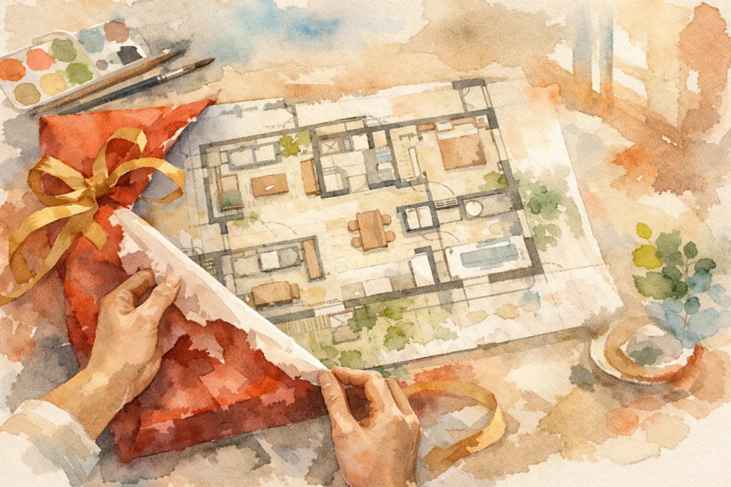
People glance at a brochure for just a moment, but everyone remembers the gift they received at Christmas, not the wrapping paper.
A glossy brochure can win a glance. A sharp facade can stop traffic in a Brisbane estate or on a new street in the Gold Coast. But if you are seriously asking, is the layout of the floor plan more important than brochure or facades, the answer is usually yes – and by a long margin. People live in the layout every day.
That’s where so many homes miss the mark. They lure buyers in with a great exterior, then trap them in dim hallways, awkwardly placed rooms, misaligned walls and rooflines, wasted corners, and living spaces that never quite feel right thanks to poor alignment or clunky spatial layouts. We take the opposite view. The schematic layout is the engine room. When a home’s layout is thoughtfully designed and carefully planned, it can hold lasting appeal for builders, buyers, and the market, with an added emotional charm that boosts its value when it’s time to sell.
Why the floor plan layout usually beats brochure and facades
A brochure is marketing. A facade is first impression. The floor plan is the performance that builds on a solid foundation.
That distinction matters because performance is what people pay for over time. A well-planned home improves movement, light, privacy, furniture placement and how the whole house feels from morning through to night. A weak layout, on the other hand, will irritate the owner long after the facade has become familiar and the brochure has ended up in the rubbish bin.
This is not a case of facades being irrelevant. Street appeal still helps sell homes, especially for builders running display stock or project ranges in competitive estates. But if the inside does not back up the outside, buyers notice fast. That disconnect is where cookie-cutter design starts to look tired.
The stronger commercial position is obvious. A builder with distinctive, well-resolved floor plans has a point of difference that is harder to copy than a brochure style or decorative front elevation. Anyone can freshen up artwork. Few can create a layout that feels fluid, bright, and truly livable while staying perfectly fresh and on trend.
Is the layout of the floor plan more important than brochure or facades for resale?
In most cases, yes. Buyers remember how a home worked more than how the brochure was styled.
When people inspect a home, they react emotionally to the sequence of spaces. They notice whether the entry feels cramped, whether the kitchen owns the living zone properly, whether bedrooms are tucked away with privacy, and whether there is dead space they cannot justify. Those reactions drive decisions.
A facade might get them through the front door. The layout is what closes the deal.
This is especially true in practical Australian conditions. On tighter suburban lots in places like Sydney, Newcastle or the Sunshine Coast, every metre has to pull its weight. On acreage sites, the plan still matters because orientation, zoning and indoor-outdoor flow become even more important. Either way, the market rewards plans that make daily life easier.
The trade-off – when facades do matter
There is a catch, and pretending otherwise would be lazy. Facades matter more in some scenarios than others.
If a builder is selling house and land packages, display homes or speculative builds, the facade is often the first hook. It can influence perceived value before anyone studies the plan. In streets where neighbouring stock looks repetitive, a fresh facade can be a commercial advantage. For a buyer who wants a statement home, the front elevation may even be the emotional trigger that starts the purchase.
But that still does not make facade more important than layout. It just means the facade has a frontline sales role. The better approach is not choosing one over the other. It is making sure the outside promise is matched by the inside logic.
A dramatic roofline and bold frontage should lead into a plan that feels equally considered. If the outside says designer living and the inside feels like an afterthought, the home loses credibility.
Floor plan mistakes that brochures hide
A polished brochure can disguise weak planning surprisingly well. Clever renders, furniture styling and colour palettes can create excitement around a house that is not actually resolved.
The common traps are easy to miss on paper. Corridors can be too long. Minor bedrooms may be undersized once real furniture goes in. Kitchens can look generous in perspective drawings but fail to deliver practical bench length. Alfresco areas may appear connected but sit awkwardly off the main living zone. A pretty front image will not fix any of that.
This is why floor plans deserve harder scrutiny than marketing material. Builders should be asking whether the design helps sales conversion and client satisfaction. Buyers should be asking whether the home supports real life, not just a launch image.
Smarter layouts for builders in Brisbane and beyond
For builders, the layout question is not just about design taste. It is about product strength.
A strong plan can work across multiple facades, allowing better range flexibility without losing the heart of the design. It can also suit varied client needs more effectively, from first-home buyers to downsizers, families on narrow lots or buyers chasing a more boutique feel. That matters if you want exclusive design rights in your area and a sharper identity than old-school standard stock.
Commercially, smarter planning also reduces friction. Clear wall alignment, efficient circulation and thoughtful zoning can make homes easier to present, easier to explain and easier to sell. When buyers walk through and instantly understand the home, the sales process tightens.
That is one reason editable CAD and DWG-based concept plans are so valuable. Builders are not locked into stale one-size-fits-all stock. They can work from a stronger base design and shape it to suit their market while protecting brand differentiation.
Examples from our ranges that prove layout leads
You can see the difference when a design range is driven by plan quality first.
In the Acreage range, the Severn 248 shows how wider sites should not be wasted on empty floor area and offer an appealing open plan flow. The best acreage homes do not just spread out – they zone family life intelligently, create sightlines and make entertaining feel natural.
For tighter sites, the Narrow Courtyard range example being the Adina 203 is the kind of plan that proves frontage limitations do not have to lead to bland outcomes. A smart internal arrangement can capture light, privacy and openness where lesser plans become tunnel-like.
In the Granny Flat and Garage at Rear category, the Granny Flat example being the Vespa 60 highlights how compact micro footprints need even sharper planning discipline. There is no room for dead zones in this kind of product.
The Modern range example being the Sonet 202 shows how contemporary style works best when the layout supports the look. Modern design is not just about a slick facade. It needs clean internal flow and spaces that feel intentional with a dynamic front on look of deliberate roof alignment.
From the Casa range, the Casa Nazare 244 demonstrates that character and liveability should rise together. If the internal planning is confident, the whole home carries more authority. The kitchen certainly stands out with its central hub appeal.
The Villa range example being the Villa Foligno 268 is another reminder that boutique appeal is never just skin deep with this bold look. Buyers in this segment expect a home to function with polish, not just pose well in a brochure.
And in the Homestarter and Corner Block range, the Aston 127 reflects a simple truth – entry-level product still needs punch. Budget-conscious does not mean boring, and practical does not mean plain.
How buyers should judge a plan instead of falling for the brochure
The smartest buyers do not ask whether a home looks impressive for ten seconds. They ask whether it will feel right for ten years.
Start with movement. Can you walk through the home without wasted detours? Then check zoning. Are bedrooms protected from noisy living areas? After that, look at natural light, storage, furniture logic and whether the kitchen truly connects to where people gather. Finally, consider how the design fits the block rather than forcing the block to serve a generic plan.
That is where brochure-led decisions often fail. They encourage buyers to chase surface appeal before testing the plan properly. The result can be a home that photographs well but lives poorly.
The sharper answer to is the layout of the floor plan more important than brochure or facades
If the goal is long-term satisfaction, stronger resale appeal and a better product for market, the layout wins. Not because brochures and facades have no value, but because they cannot rescue a weak internal plan.
The best homes are remembered for how they feel to live in. They minimise dead ends, avoid gloomy leftover spaces and create that rare sense of flow where each room belongs exactly where it should. That is the difference between a design that merely looks current and one that actually performs.
Builders who want point of difference and buyers who want more than a dressed-up standard plan should treat layout as the serious decision. Everything else should support it, not distract from it.
Ready to move past bland, brochure-led design?
If you want plans with more punch, something different, better flow and genuine market difference, start with the layout and let the rest follow. Explore our full design library

